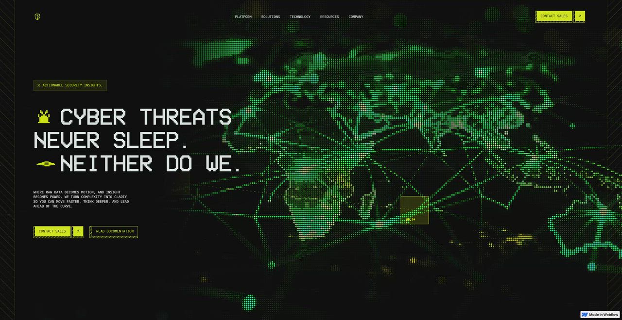
01 / The problem
Don’t describe the system. Be part of it.
Corelogic monitors infrastructure around the clock. The site should feel like you’re already looking at that system: live data, terminal type and interfaces that react. Visitors get a sense of the product before they read a word about it.
- 01Feel like a live monitoring system.
- 02Show features working.
- 03A visual language taken from the terminal.
- 04A fast, scalable Webflow build.
02 / Wireframes & copywriting
Three emotional states, in order.
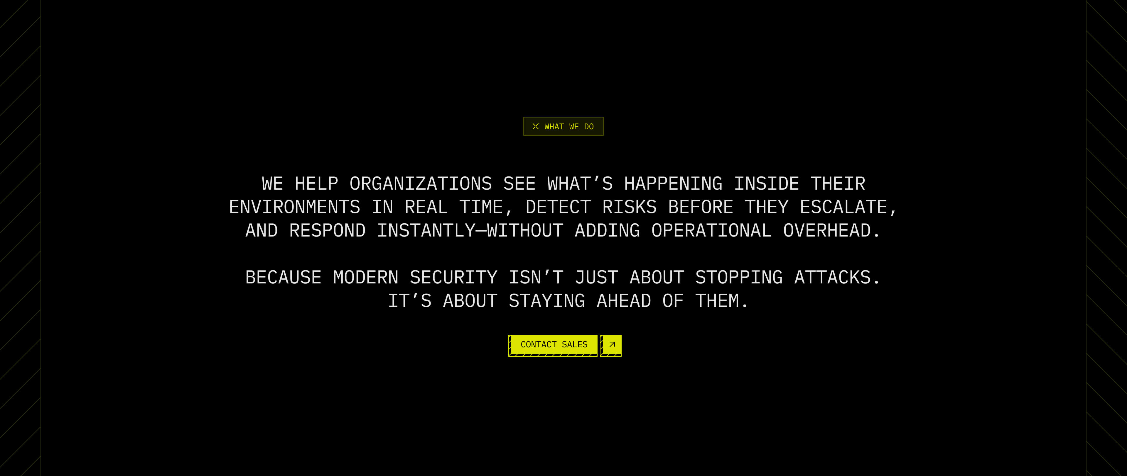
The homepage alternates between confidence, education and validation, so visitors trust the brand before they are asked to learn anything.
Confidence
Large statements establish trust: “Cyber threats never sleep. Neither do we.” The tone is calm and reassuring.
Education
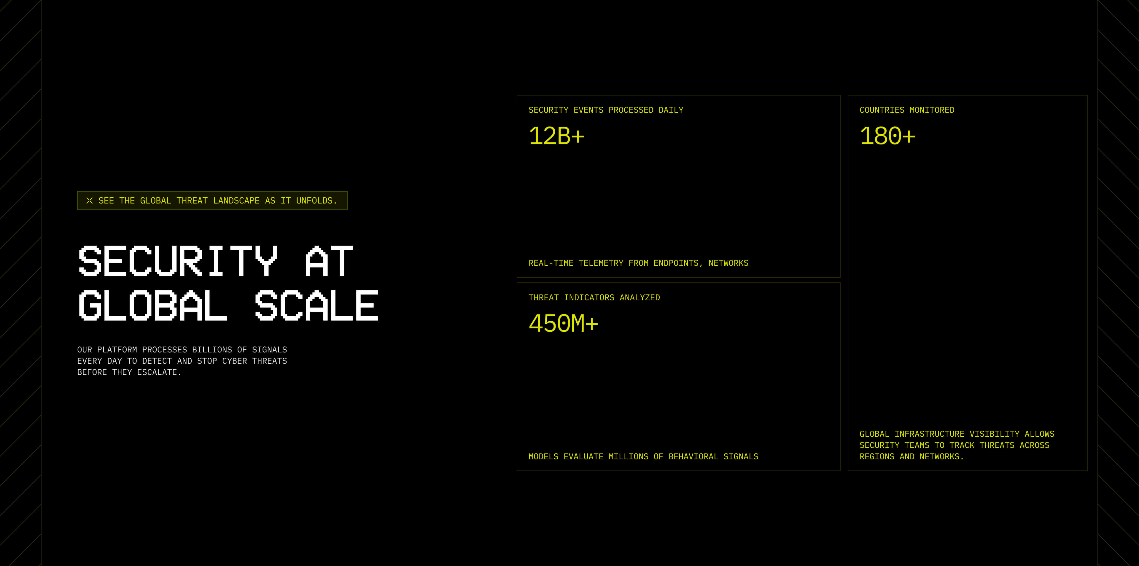
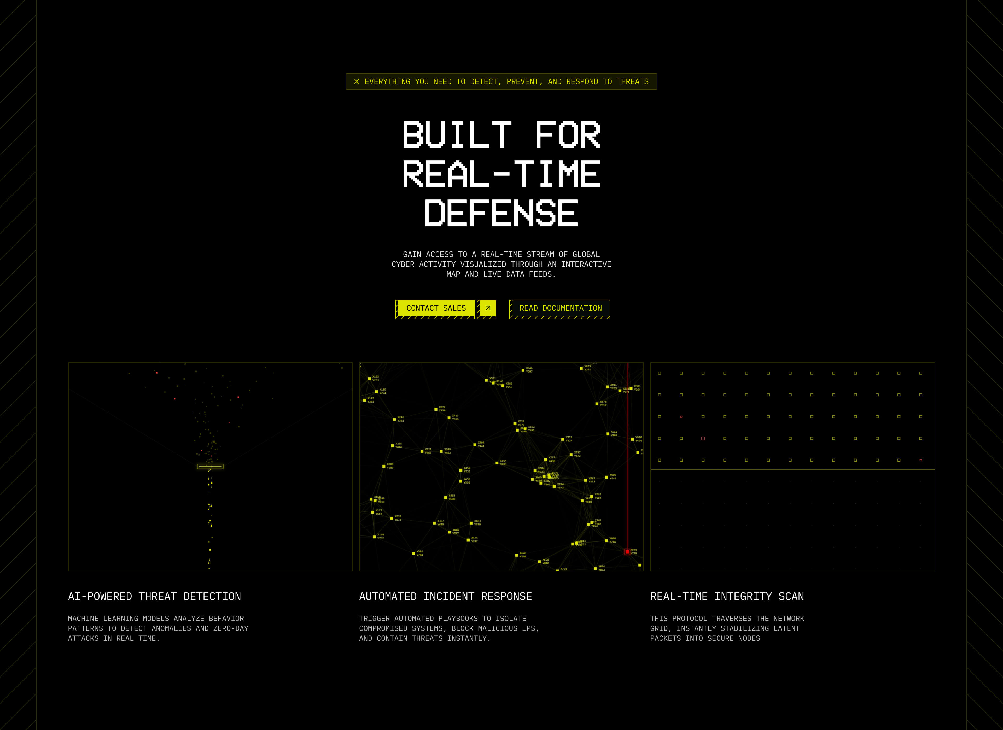
AI detection, automated response and global monitoring, each shown as a visual that’s understood at a glance.
Validation
Testimonials, metrics and a clear call to action to lift conversion.
03 / Visual direction
Built from the terminal.
The visual direction comes from the tools security teams work in every day: a terminal-inspired aesthetic with yellow as the main accent. Yellow references command lines and alerts and gives strong contrast on black, so the site reads like a blend of a futuristic dashboard and a monitoring system.
Terminal type
A pixel display face for headlines, monospace for everything else.
Alert yellow
One loud accent for actions and live data, nothing else competes.
Hazard details
Striped borders and tags that read like system warnings.
#000000 Yellow
#DEE50D Yellow 25
#F6F8C2 Yellow 10
#FCFDE7 Mint cream
#EAF5F3 Mint 75
#F0F8F6 Mint 25
#FAFCFC
Aa
VCR OSD Mono, headlines
IBM PLEX MONO, BODY AND LABELS
- H1Cyber threats never sleep.VCR OSD Mono 95px
- H2Built for real-time defense.VCR OSD Mono 75px
- H3Security at global scaleIBM Plex Mono 42px
- H4AI-powered threat detectionIBM Plex Mono 32px
- H5Automated incident responseIBM Plex Mono 21px
- P1Our platform processes billions of signals every day.IBM Plex Mono 14px
- P2× SEE THE GLOBAL THREAT LANDSCAPE AS IT UNFOLDSIBM Plex Mono 10px
04 / Micro interactions
Movement that feels intentional.
One of my favourite parts of the project. The motion stays subtle: enough energy to make the platform feel active, without competing with the content.
- Feature cards: a small AI-assisted tool generated interaction behaviours, so each card shows its feature’s logic.
- Living infrastructure: Unicorn Studio scenes that feel like a running system.
- Hero: a blob-tracking animation I made by generating the visual in Midjourney and animating it in Unicorn Studio, plus animated SVGs and mouse interaction to grab attention at first glance.
05 / Webflow development
Not a translation, an architecture.
I rebuilt the whole system in Webflow as a scalable structure, so new pages and sections can be added without breaking the design.
Two real-device problems shaped the build:
- Power-saving lag: on unplugged laptops, browser power-saving mode made the high-fidelity Unicorn Studio scenes stutter and load slowly. I swapped them for optimised background videos on laptop viewports, keeping the visual impact with faster, consistent loading.
- iOS autoplay: on iPhone, those videos wouldn’t load until tapped, and showed a play button. I wrote a fix that hides the play/pause controls, shows a poster of the first frame, and starts every video on the visitor’s first touch anywhere on the page.
- LayoutResponsive at every breakpoint.
- SectionsModular, ready for new pages.
- SpacingOne consistent spacing system.
- MotionPerformant interactions, video fallbacks that play on iOS.
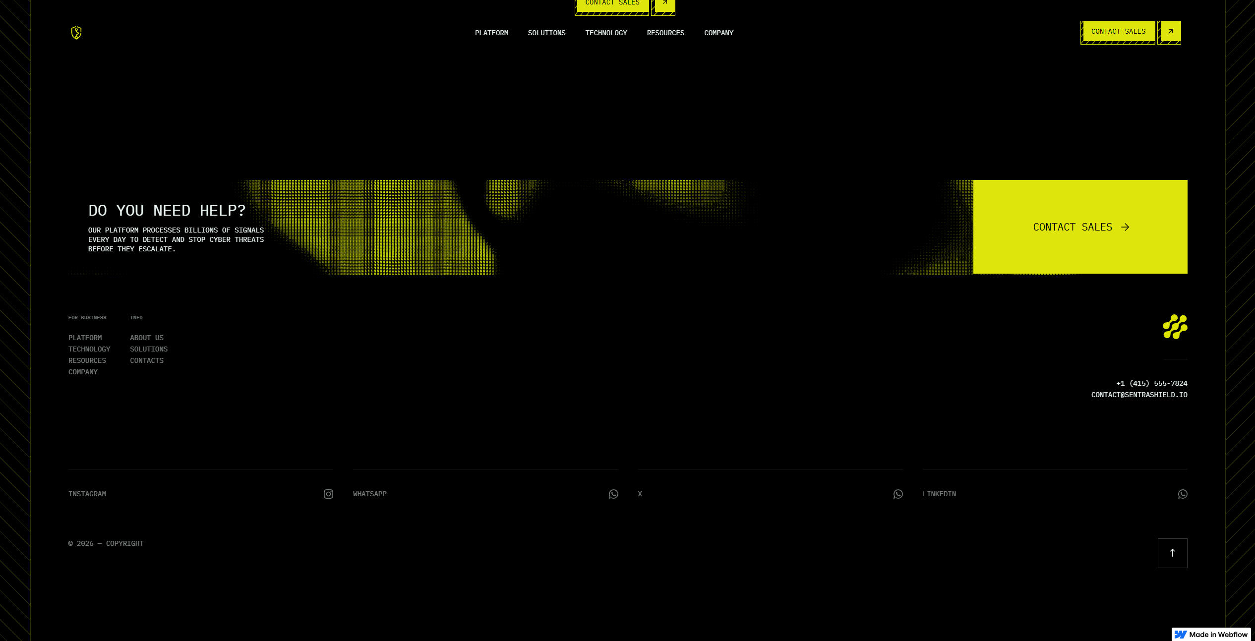
06 / What shipped
Clear, credible and alive.
- SiteResponsive, live on Webflow.
- SystemType, colour, components and spacing.
- MotionHero interactions, feature cards and Unicorn Studio scenes.
- ContentCopywriting for every section.
How I work
Built for sites millions of people see.
Pages and microsites
A system for core pages, room for bold launches.
I can code it
Shipped in code or Webflow, so ideas survive handoff.
AI in the loop
Faster exploration, human judgement on what ships.