01 / The brief
A workflow you have to see to believe.
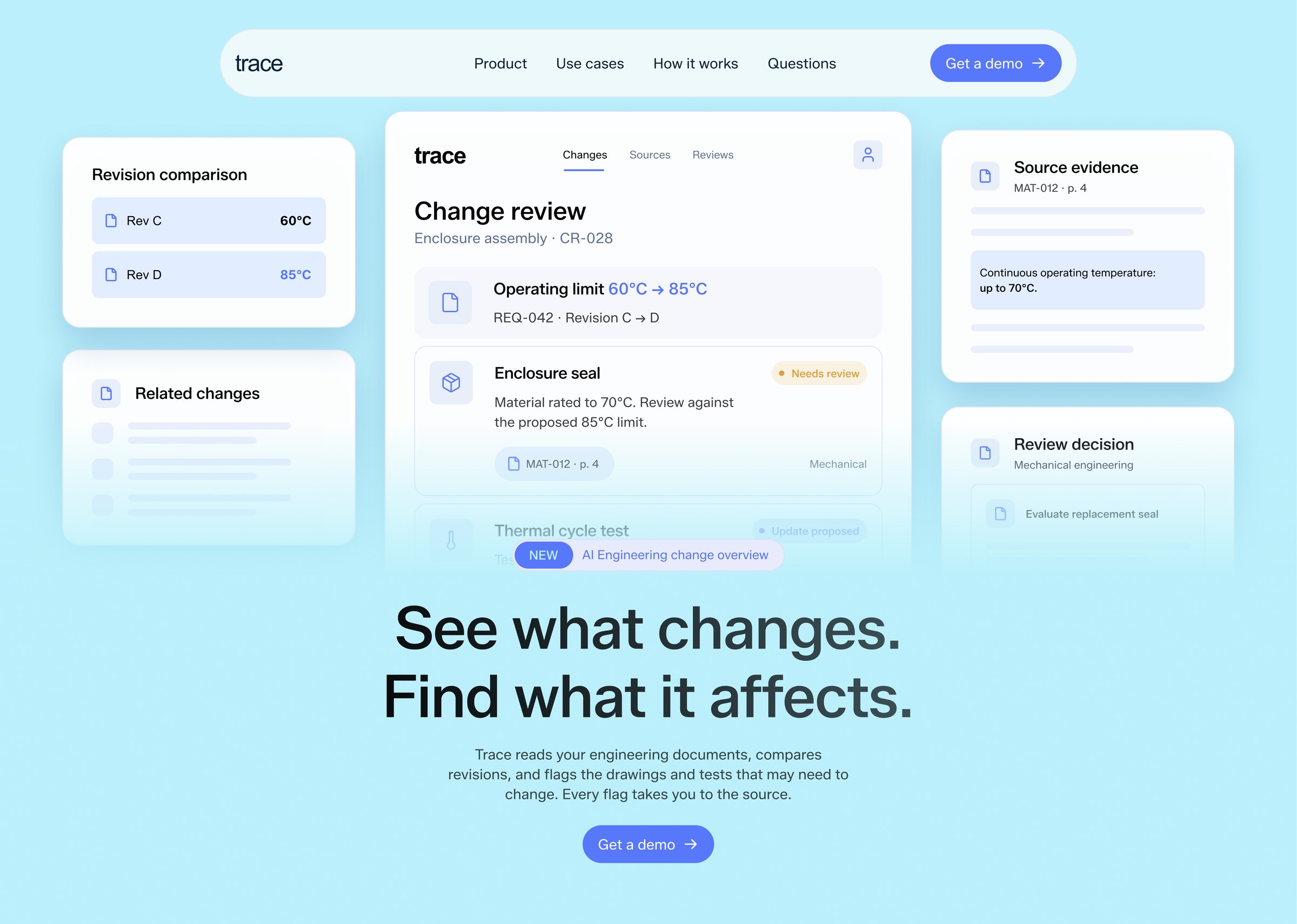
Trace reads requirements, drawings and test documents, compares revisions, and flags everything a change may affect. Every flag links back to its source. The workflow makes sense the moment you see it running, so the site had to show it.
- 01Explain each feature without a wall of text.
- 02Show the source behind every claim.
- 03Speak the language of review teams.
- 04One conversion path: Get a demo.
02 / Positioning
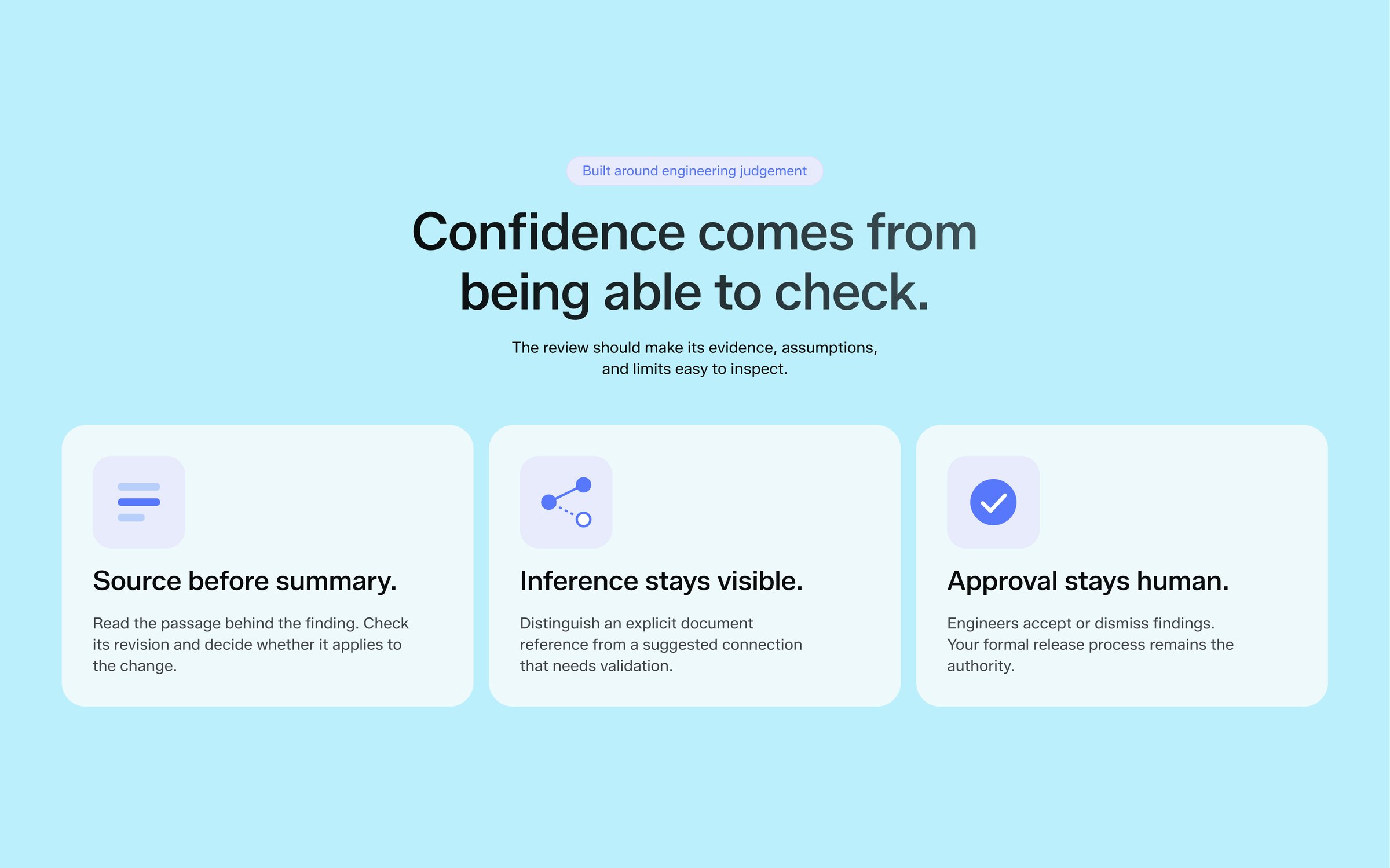
Trust comes from the source.
Engineers don’t trust an answer they can’t check. So the whole story hangs on one promise: every flag takes you to the exact passage it came from. The headline does the rest: “See what changes. Find what it affects.”
Audience
Systems and review leads buried in revisions.
Promise
Every impacted drawing and test, with its source.
Proof
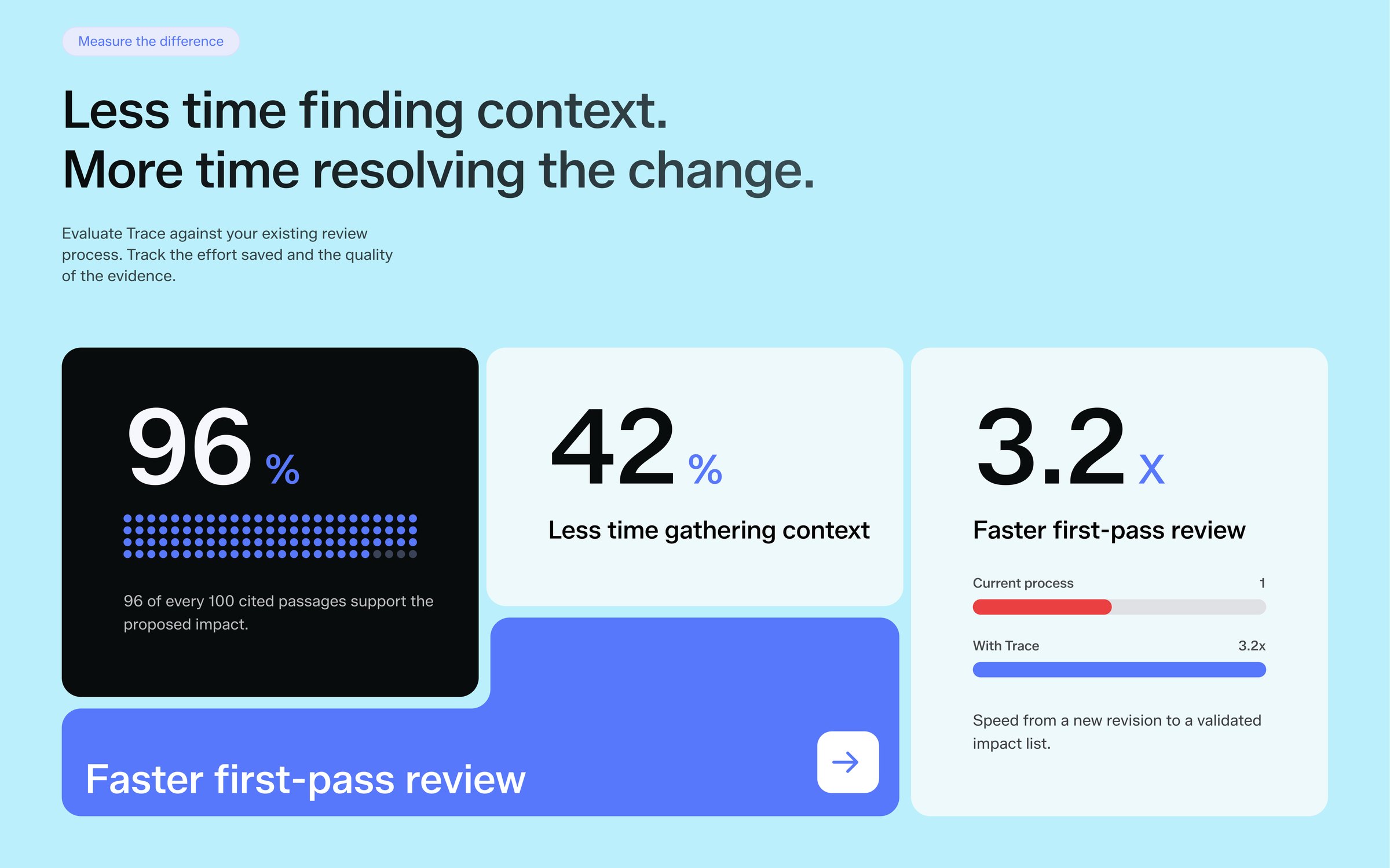
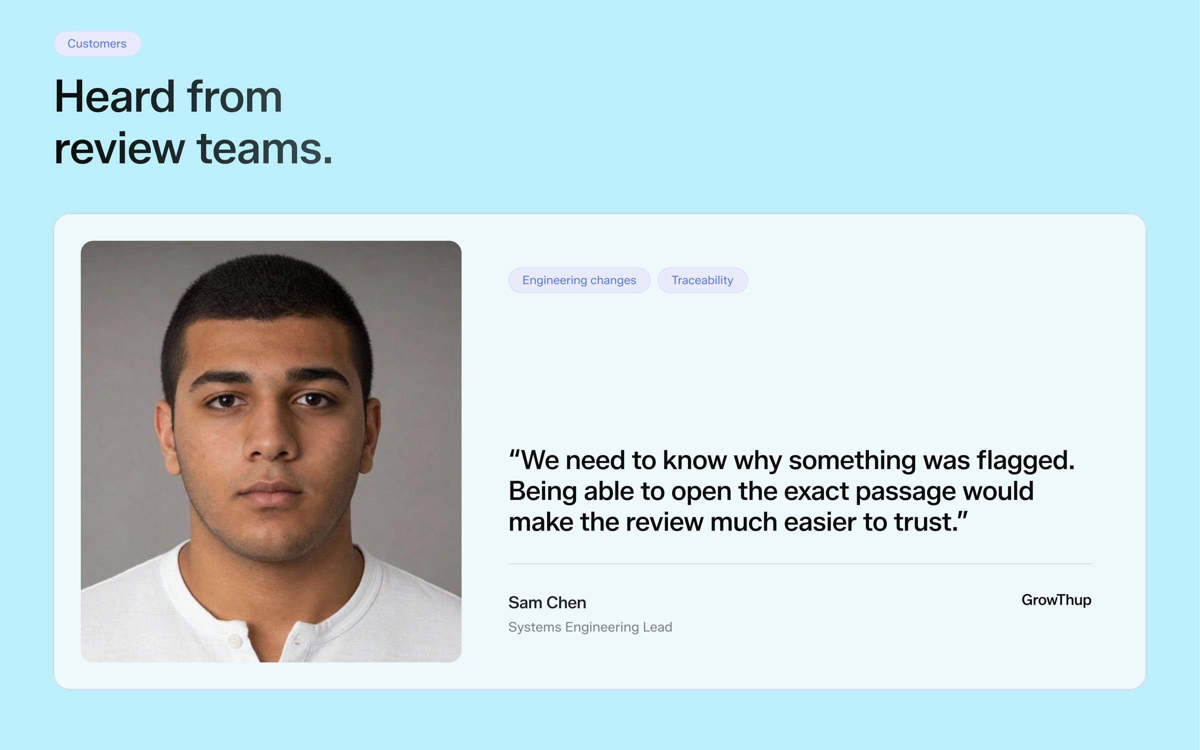
Cited-passage accuracy, time saved, review-team quotes.
Action
Get a demo, or try it on your own revision.
03 / Moodboard
Soft light, sharp product.
Blurred gradients and grainy textures, product cards floating over soft imagery, and proof sections built around big, clear numbers.
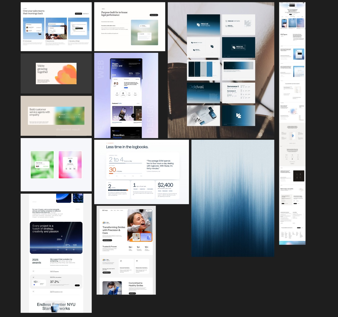
UI over imagery
Crisp product cards layered on blurred, out-of-focus backgrounds.
Grain and gradient
Fine noise gives soft colour fields depth and a tactile feel.
Numbers as proof
Large figures with small labels, so results read at a glance.
04 / Brand
Soft, grainy, calm.
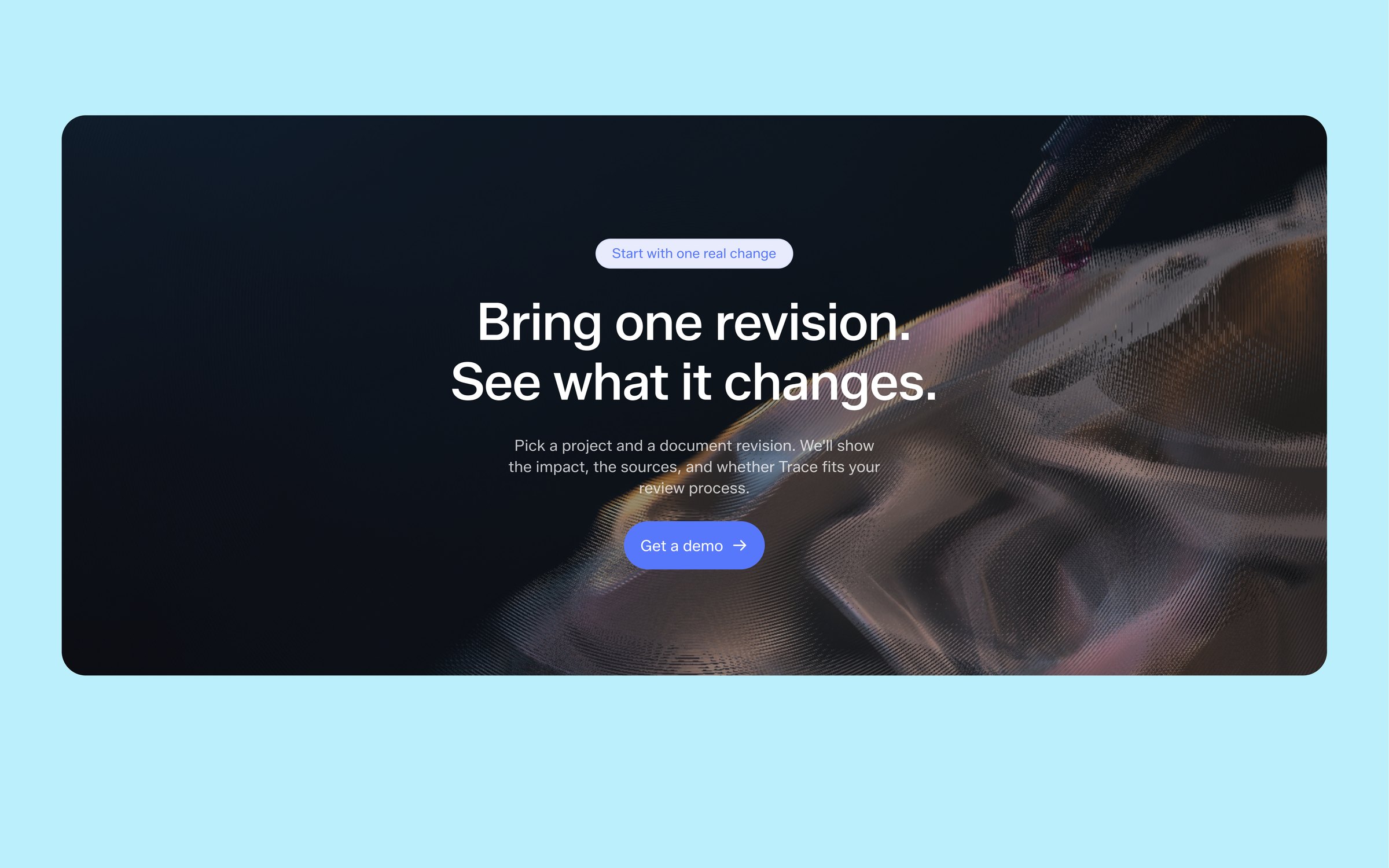
Trace is used for careful, detailed review work, so the brand should feel calm and precise: a light sky blue, soft, subtly rounded shapes, and imagery with a fine grain. For that grain I built a small interactive tool with AI that applies a noise filter to images, so every visual gets the same tunable texture while the product UI on top stays crisp.
Noise filter tool
A small tool, built with AI, that adds interactive, tunable grain to any image.
Soft and rounded
Gentle corner radii on cards, pills and the floating nav.
One accent
Blue for actions and data, red only where something needs attention.
#BBEFFC Mist
#E8F3F5 Surface
#EFFAFC Signal blue
#5679F9 Flag red
#E04749 Ink
#080C0D
Aa
Zalando Sans, headlines and body
REGULAR 400 · MEDIUM 500
- H1See what changes.Zalando Sans 64px
- H2Start where review hurts mostZalando Sans 48px
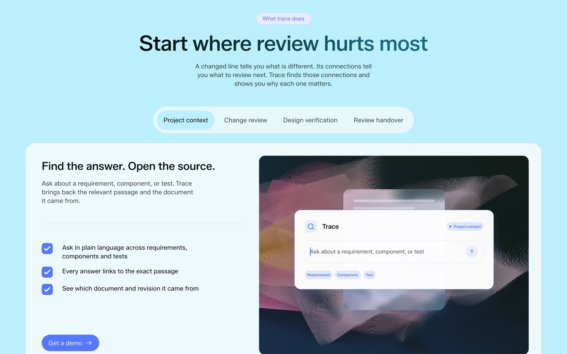
- H3Find the answer. Open the source.Zalando Sans 24px
- Quote“We need to know why something was flagged.”Zalando Sans 22px
- BodyTrace reads your engineering documents and compares revisions.Zalando Sans 16px
- SmallEvery answer links to the exact passageZalando Sans 14px
- LabelNeeds reviewZalando Sans 12px
05 / UI animations
Every feature, shown working.
Each feature plays as a short UI animation, because watching Trace do the job explains it faster than a paragraph could: a question gets traced to its source, a revision flags the parts it touches, a number fills in.
06 / Build
Designed and shipped by the same hands.
I built the front end myself, so the animations kept their timing and feel from design to production, and every section works on mobile.
07 / What shipped
A product story you can watch.
- SiteResponsive marketing site, front-end built.
- MotionUI animations for every core feature.
- BrandColour, type, soft shapes, noise-filter tool.
- ContentCopywriting for every section.
How I work
Built for sites millions of people see.
Pages and microsites
A system for core pages, room for bold launches.
I can code it
Shipped in code or Webflow, so ideas survive handoff.
AI in the loop
Faster exploration, human judgement on what ships.